Text Mining Our Dealer Reviews
At Auto Trader, knowing our customer is very important to us, and we invest a lot in researching what makes them tick. In previous posts, we described how we used text mining to understand our customers through our customer support descriptions. We have another very valuable source of data: our dealer reviews.
We provide customers who buy a vehicle that’s advertised on Auto Trader with the opportunity to post a review about their experience with that dealer. These reviews are posted on the Auto Trader website. Each review contains text and a star rating, and each review is moderated both automatically and manually to ensure quality.
Here, we’ll describe how you can use a combination of visualizations, word vectorization and sentiment analysis to discover more about your customers through their customer reviews. we’ll also show you how the technique can in turn be used to help moderate the reviews that you get, speeding up the cycle.
First rule: when it comes to data analysis, the more visually you can present the data the better. Python has some quite wonderful libraries and services. Let’s start with a good old-fashioned word cloud.
import csv, string, collections
import matplotlib.pyplot as plt
from wordcloud import WordCloud, STOPWORDS
import wordcloud

def createWordCloud(text):
    	return WordCloud(
    	              stopwords=STOPWORDS,
                          background_color='white',
                          width=1000,
                          height=500
                         ).generate(text)

def showWordCloud(wordcloud, title):
		fig = plt.figure()
		plt.imshow(wordcloud)
		fig.suptitle('Dealer Reviews', fontsize=14, fontweight='bold')
		ax = fig.add_subplot(111)
		fig.subplots_adjust(top=0.85)
		ax.set_title(title)
		ax.axis('off')
		plt.show()

def cleanText(sentences):
    cleaned_sentences = [sentence.translate(string.maketrans("","").lower(),
        string.punctuation) for sentence in sentences]
    return string.join(cleaned_sentences)

def createText(your_list):
    sentences = [element[0] for element in your_list
        if element[3] == 'crisp' and element[4] == '2']
    sentence = cleanText(sentences)
    ratedSentenceDict = getRatedSentences(your_list)
    return (sentence, ratedSentenceDict)

with open('reviews_with_sentiment_scores.csv', 'rU') as f:
    reader = csv.reader(f)
    all_reviews = list(reader)

sentences = [element[0] for element in your_list]
text = cleanText(sentences)
wordcloud = createWordCloud(text)
showWordCloud(wordcloud, “My wordcloud”)
Here’s a word cloud for all reviews:
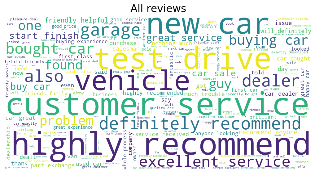
They seem pretty happy overall. Great service and test drives seem to be high on the priority list. What about our unhappy customers?
Here’s a word cloud for our one star reviews:
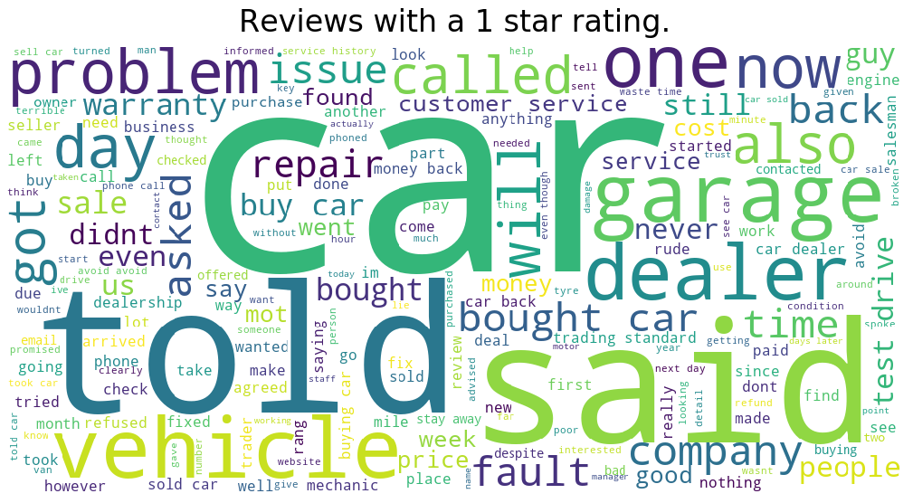
Seems like honesty is quite important here: “told” and “said” are appearing quite frequently. But what has the dealer been telling our customers that they are unhappy about? Here’s where word clouds offer limited help. For example, “warranty” is quite important, but is it connected to what was “told”? Fortunately, Python has a wonderful open source library called gensim, which implements the word2vec model. If you prefer R, there’s a similar “text2vec” library. Word2vec uses a two layer neural net to process your text, and map words into vector space based on what context they appear in in your text. This affords you many ways to deeply analyse your text, described in more detail in this blog about another word2vec implementation. For our purposes, we’re going to use predictions to predict what word a customer was likely to have said, given a particular topic.
For example, we might like to know what it was the dealer “told” the customer. So, if our customers said “dealer told”, what were the most likely words to occur closely in this context?
from wordcloud import STOPWORDS
import gensim
from gensim.models.word2vec import Word2Vec
import csv
import string

with open('reviews_with_sentiment_scores.csv', 'rU') as f:
    reader = csv.reader(f)
    your_list = list(reader)
fname = "allvectors.bin"
reviews = [element[0] for element in your_list]
reviews = [sentence.translate(string.maketrans("","").lower(), string.punctuation)
    for sentence in reviews]
reviews = [sentence.split() for sentence in reviews]
list_of_stopwords = list(STOPWORDS)
sentences = [[sentence for sentence in review if sentence not in list_of_stopwords]
    for review in reviews]
model = Word2Vec(sentences, size=100, window=5, min_count=3, workers=5)
model.save(fname)
predictions = model.predict_output_word(['dealer', 'told'], topn=20)
This will create twenty predictions of words that occurred close to where the words “dealer told” occurred. We’ve displayed the results in a bubble chart in javascript D3, as appears in this blog. Note, we’ve used this library to be able to use D3 in Angular 4.
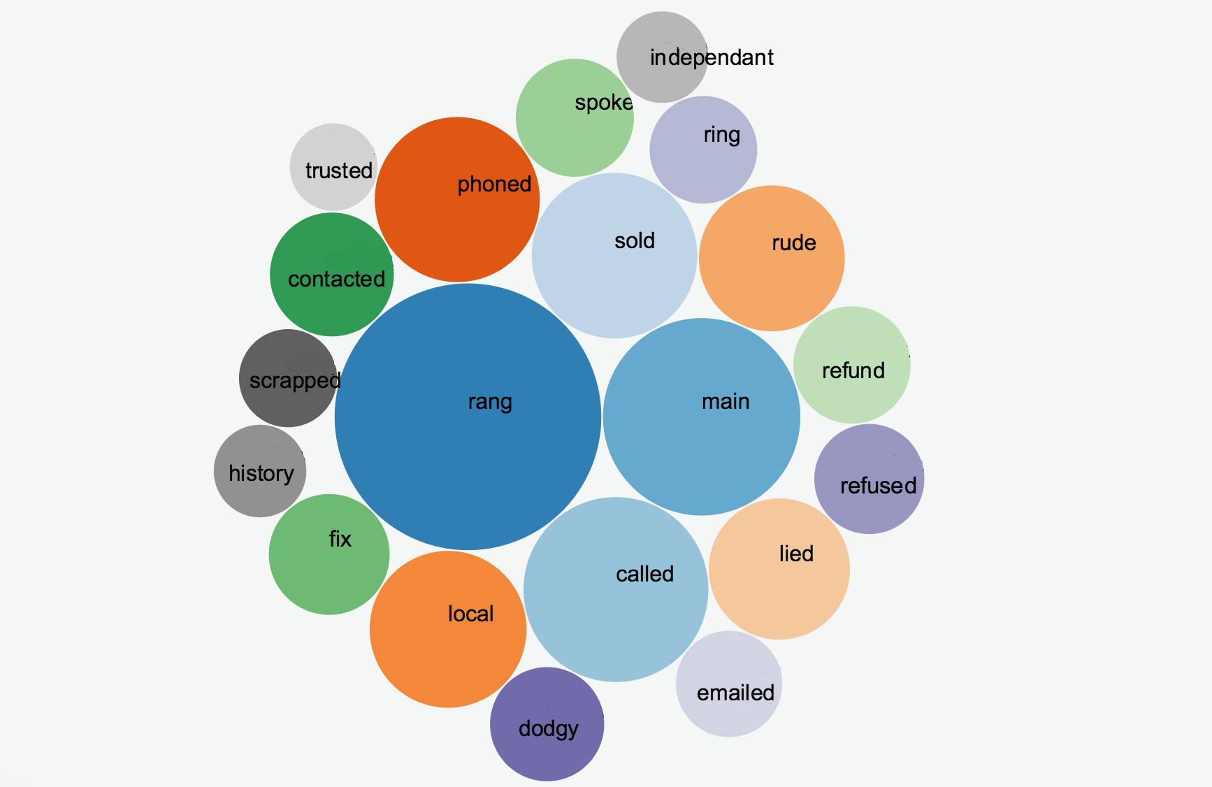
Pretty neat! There are infinitely many more things you can find out about what’s on your customer’s minds, purely by changing the text “dealer told” in the code above. We’ve found that rather than showing some glossy graphs in a PDF report to interested parties, it’s much better to have living graphs that people can interact with and explore themselves. To do this in a lean way, we use Jupyter Notebook, which allows me to code in Python directly in my browser, and change and execute sections of the code at will. Jupyter Notebook will display the results in the browser directly under the code. It’s a lot quicker than creating a web application to allow users to interact with their data, as long as you’re happy to sit with them.
Analysing Sentiment
So we know what customers care about, but are they happy? To find out, we’re going to use a Python service called Plotly to visualise the star rating and sentiment of the customer in their reviews. Firstly, we need to carry out some sentiment analysis on the reviews.
We’ll use an open source library called Sentlex, which gives two overall sentiment scores based on the positivity or negativity of the words in a block of text.
Here we update a spreadsheet of reviews with each review’s overall “positive sentiment” and overall “negative sentiment”.
# Assign scores and save back to sheet
import xlutils
from xlutils.copy import copy
import sentlex
import sentlex.sentanalysis

wb = copy(book)
sheet_write = wb.get_sheet(0)


SWN = sentlex.SWN3Lexicon()
classifier = sentlex.sentanalysis.BasicDocSentiScore()

for doc_index in range(len(doc_list)):
    classifier.classify_document(doc_list[doc_index], tagged=False, L=SWN, a=True,
        v=True, n=False, r=False, negation=True, verbose=False)
    sheet_write.write(doc_index, 7, classifier.resultdata['resultpos'])
    sheet_write.write(doc_index, 8, classifier.resultdata['resultneg'])

wb.save('~/Documents/exportDRAudit_with_sentiment_scores.xls')
This outputs a csv file, mapping each review to the positive sentiment score and negative sentiment score of the review. Now we can create a graph using Plotly to show what percentage of our customers were happy.
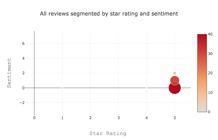
We can see here that the vast majority of customer reviews we receive are five star reviews, and the sentiment ranges from neutral to mildly positive. As you would expect, while our customers report high satisfaction, the language they use is quite reserved or neutral, as you would see often in polite conversation.
The code for creating this graph is below.
Here we calculate the data for the graph:
import collections

def calculateSentiment(positive_sentiment, negative_sentiment):
    return int(float(positive_sentiment) - float(negative_sentiment))

def addToDict(approval_dict, overall_rating, sentiment):
    key = (overall_rating, sentiment)
    approval_dict[key] += 1

def calculateRatioDictEntry(key, total_num_reviews):
    accepted_ratio_dict[key] = calculateRatio(key, total_num_reviews)

def calculateRatio(key, total_num_reviews):
    accepted = accepted_dict[key]
    return (float(accepted) / total_num_reviews)


def buildDataForAllReviews(x = [], y = [], color = [], size = []):
    accepted_dict = collections.defaultdict(int)
    accepted_ratio_dict = collections.defaultdict(float)
    total_num_reviews = 0

    for review_text, review_title, overall_rating, updated_by, status, created,
            positive_sentiment, negative_sentiment in your_list[1:]:
        sentiment = calculateSentiment(positive_sentiment, negative_sentiment)
        addToDict(accepted_dict, overall_rating, sentiment)
        total_num_reviews += 1

    for key in accepted_dict.keys():
        calculateRatioDictEntry(key, total_num_reviews)

    stars_ratings = [stars for (stars, sentiment) in accepted_ratio_dict.keys()]
    sentiment_ratings = [sentiment for (stars, sentiment) in accepted_ratio_dict.keys()]

    keys = []
    for stars_rating in stars_ratings:
        for sentiment_rating in sentiment_ratings:
            x.append(stars_rating)
            y.append(sentiment_rating)
            key = (str(stars_rating), sentiment_rating)
            keys.append(key)
            color.append(int(accepted_ratio_dict[key] * 100))
            size.append(int(accepted_ratio_dict[key] * 100))
We then generate a graph from the data:
import plotly
import plotly.plotly as py
import plotly.graph_objs as go

def getPlotAllReviewsFilenameAndLayout():
    filename = 'all-reviews'
    layout = go.Layout(
        title='All reviews segmented by star rating and sentiment',
        xaxis=dict(
            title='Star Rating',
            titlefont=dict(
                family='Courier New, monospace',
                size=18,
                color='#7f7f7f'
            )
        ),
        yaxis=dict(
            title='Sentiment',
            titlefont=dict(
                family='Courier New, monospace',
                size=18,
                color='#7f7f7f'
            )
        )
    )

    return filename, layout
We then show the graph:
import plotly
import plotly.plotly as py
import plotly.graph_objs as go

def showPlot(filename, layout, x, y, color, size):
    data = [
        {
            'x': x,
            'y': y,
            'mode': 'markers',
            'marker': {
                'color': color,
                'size': size,
                'showscale': True
            }
        }
    ]

    plotly.tools.set_credentials_file(username='your-username',
        api_key='get-this-from-plotly')
    figure=go.Figure(data=data, layout=layout)
    py.iplot(figure, filename=filename, file_id=filename)


accepted_dict = collections.defaultdict(int)
rejected_dict = collections.defaultdict(int)
accepted_ratio_dict = collections.defaultdict(float)
rejected_ratio_dict = collections.defaultdict(float)

x = []
y = []
color = []
size = []
keys = []

buildDataForAllReviews(x, y, color, size)
filename, layout = getPlotAllReviewsFilenameAndLayout()

data = [
        {
            'x': x,
            'y': y,
            'mode': 'markers',
            'marker': {
                'color': color,
                'size': size,
                'showscale': True
            }
        }
    ]

plotly.tools.set_credentials_file(username=username, api_key=api-key)
figure=go.Figure(data=data, layout=layout)
py.iplot(figure, filename=filename, file_id=filename)
So with a largely satisfied customer base, with politely worded reviews, is there any need for moderating our reviews? At Auto Trader, all our reviews pass through two stages of moderation. Firstly, every single review is moderated manually by an Auto Trader employee. We have a set of moderation guidelines used in order to protect readers and dealers, as well as protect Auto Trader from sharing libellous content. Then we have an automated system designed to ensure that the source of a review is genuine.
We can use the same code to take a look at the proportion of reviews that are rejected through our manual moderation system. Here, the size of the bubble represents the fraction of reviews rejected through moderation in this sample of data.
def calculateRatioDictEntry(key):
    rejected_ratio_dict[key] = calculateRatio(key)

def calculateRatio(key):
    accepted = accepted_dict[key]
    rejected = rejected_dict[key]
    if rejected + accepted == 0:
        return 0.0
    else:
        return float(rejected) / (rejected + accepted)

def buildDataForModeratedReviews(x = [], y = [], color = [], size = []):
    for review_text, review_title, overall_rating, updated_by, status, created,
        positive_sentiment, negative_sentiment in your_list[1:]:
        sentiment = calculateSentiment(positive_sentiment, negative_sentiment)
        if (status == '1'):
            # A review has been accepted and added to the site
            addToDict(accepted_dict, overall_rating, sentiment)
        elif (updated_by == 'crisp' and status == '2'):
        	 # A review has been manually rejected by a moderator
            addToDict(rejected_dict, overall_rating, sentiment)

    for key in rejected_dict.keys():
        calculateRatioDictEntry(key)

    stars_ratings = [stars for (stars, sentiment) in rejected_ratio_dict.keys()]
    sentiment_ratings = [sentiment for (stars, sentiment) in rejected_ratio_dict.keys()]

    keys = []
    for stars_rating in stars_ratings:
        for sentiment_rating in sentiment_ratings:
            x.append(stars_rating)
            y.append(sentiment_rating)
            key = (str(stars_rating), sentiment_rating)
            keys.append(key)
            color.append(int(rejected_ratio_dict[key] * 100))
            size.append(int(rejected_ratio_dict[key] * 100))
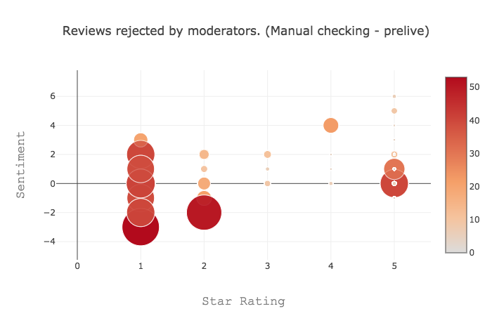
Wow! These are quite an expressive group of people! While the sentiment of our general population was quite neutral, this group has sentiment ranging from wildly positive to quite negative. It’s also interesting to note that the sentiment quite often doesn’t match up to the star rating. We can get a zero star rating with positive sentiment. When we analysed reviews rejected by our automatic system, we found a lot of positive reviews had quite negative sentiment. So now we know what a review that gets rejected looks like, could we use this to reduce the load on our manual moderators? With the ever increasing trend for customers to write a review, it’s not always feasible for a company to manually moderate each one. What a huge cost saving we could make if we used rating and sentiment analysis to flag reviews to be manually moderated!
We’ve just scratched the surface of what fantastic insight you can get from analysing your customer’s reviews, and how you can in turn use similar analysis to make hosting reviews much more cost efficient. Why not try it yourself, and tweet your comments or blog here. We’d love to hear from you!
Enjoyed that? Read some other posts.
