Building a more accessible web form
The contact forms on our website are a critical way for consumers to make contact with our advertisers. We have quite a few of them, from general “contact us” forms to enquiry forms about a specific car. In this article, we will focus on the used car contact form. This form has a huge amount of interaction. It allows users of the website to send a message to the seller of the vehicle they are looking at, which is a critical part of the process. Unfortunately, from an accessibility point of view, it wasn’t working as well as it could for everyone. We set ourselves a goal to create the best, most accessible form we could.
At Auto Trader, we are trying to bake in accessibility into everything we do. When the opportunity arose to create a new single-page app for our customer enquiry form we had a great opportunity to create the best (we hope) web form we could. As a team, we knew what we thought looked good but also knew there were areas of expertise we were not proficient in.
Getting the basics right
Many forms can be confusing for lots of people, not least for people with cognitive disabilities and/or visual impairments. Having a form that’s accessible for everyone should result in lower abandonment: increasing completion and ultimately increasing revenue.
We started along our path of improvement by using screen readers as novices. We were all pretty new to using them in anger but figured we knew enough to create something we could rely on and people could use. Screen readers are applications used by people with visual impairments. They will use text-to-speech engines allowing them to read content out aloud to users. They also use speech to provide extra context around aspects of the user interface such as menus and buttons.
In our case the basics were in place—the usual things that are a given if you read any blog on building an accessible form:
- Labels that were informative, with correct semantics and Accessible Rich Internet Applications (ARIA) labels where needed
- Buttons that did one thing
- No JavaScript interactions that couldn’t be used with a keyboard or any other input
- Obvious highlighting on tabbing
Feedback from real people
We were keen to get some feedback from members of the public who would be well placed to comment. So as soon as we had our first build ready, we shared it with a few people we found through Twitter. Both were blind and used screen readers daily. We felt this would deliver the best feedback as they were people who would be helped most by us getting this right. They came back with some interesting findings.
Placeholder text
The first interesting bit of feedback was around the use of placeholder example text. One of the users suggested these were not worth being there. We haven’t worked out if these are beneficial or not for most users, but there’s a possibility that if the label is descriptive enough then placeholders wouldn’t be needed.
The default way they’re formatted doesn’t meet contrast guidelines and the fact they’re cleared when you start typing into a field can cause confusion, especially for users with cognitive impairments.
—User One
The last issue is the example text in each edit box. I can see why you would put it there, but a blind screen reader user would not know whether or not to delete the example text or to just write over it. I have come across both scenarios with example text. IMO, the context and label is enough to let the user know what is expected. Still, I don’t think this is a massive detriment.
—User Two
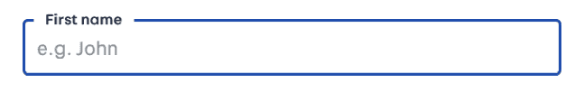
Floating labels
We wanted to create our input form elements with a Material Design floating label. Using this technique, the label which sits on top the input box floats to the top when you click or tab into the input box.
Before focus 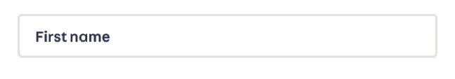
In focus
It looks neater and using space efficiently allows us to put more elements in full view of the users. We moved the label tag to follow the input tag which is the opposite way round to normal, to make sure that the white background of the label floats over the input (rather than sitting behind) without having to tweak the way the elements are layered.
We heard from the test users that the label could end up being repeated, or read in the wrong order – although we didn’t hear this ourselves when we tested using Apple’s VoiceOver screen reader.
When tabbing through the fields, the field title is in concert with the edit box. However, when I cursor down through the form, the title comes after the edit field.
—User Feedback
We had an issue in that we were trying to do every accessible thing we could—using both floating labels and ARIA. We found this clashed and ended up creating a worse experience.
I think you have two or more attributes for each field marked up, such as title and label or Aria and title. The effect of this is that each is repeated by the screen reader. For example, the first field says, “Your full name your full name….” Correcting this might correct the first issue.
—User Feedback
We dropped the ARIA tags and just relied on the label to be enough. This fixed the repeated title of each field.
Form validation
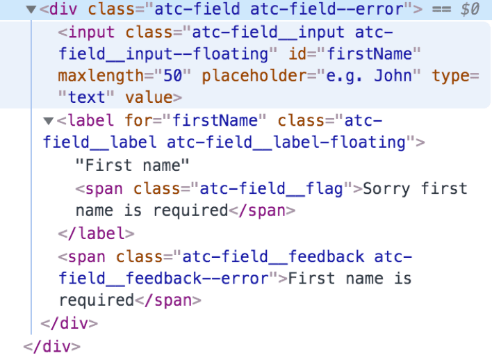
We had error validation on the fields to validate first name, surname, phone number and email address.
The first issue we spotted on form error was the feedback. While we visually highlighted the fields that had errored, when using a screen reader the feedback just wasn’t there. So you were stuck in a form with no idea why it hadn’t submitted.
We made a change so that when there was a validation error, the focus was set on the first error state. This allowed the reader to feed the error back to the user at the point that needed correction.
Before 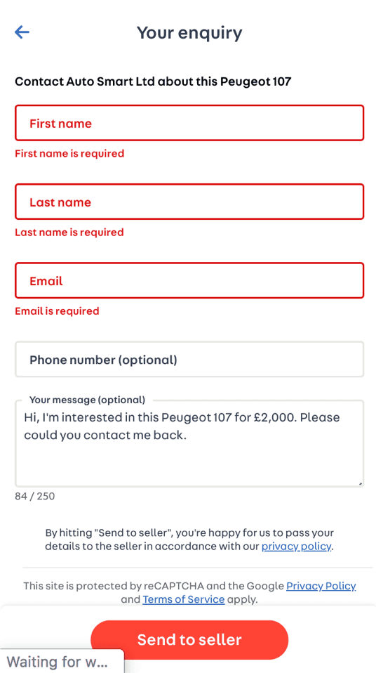
After adding focus 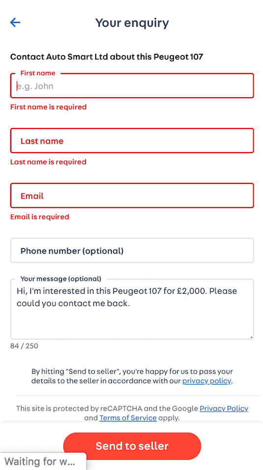
Another issue though was that the label (‘First name’ for example) was read out as ‘Firstname’. This wasn’t good enough to feedback about why you were in this state.
A visually hidden span was added into the label. This allowed us to keep the form looking as it did pre error, but also allowing the screen reader to read out a better message. Something like ‘Sorry, we need your first name’.
What is VisuallyHidden?
Developers commonly use display: none to hide content on the page. Unfortunately, this common action can be problematic for people who use screen readers, especially if the hidden content was meant to be for them to discover.
The clip pattern accomplishes this task for you: hide the content visually, yet provide the content to screen readers.
.visually-hidden {
    position: absolute !important;
    height: 1px;
    width: 1px;
    overflow: hidden;
    clip: rect(1px 1px 1px 1px); /* IE6, IE7 */
    clip: rect(1px, 1px, 1px, 1px);
    white-space: nowrap; /* added line */
}
Sliders
We also wanted to find out about sliders in forms. They look pretty and can be a nice addition if you use them in the right way. But how are they for screen readers?
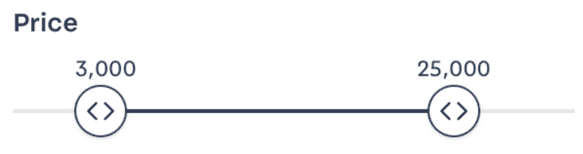
Generally, I’d say to avoid them. They can be tough to do in an accessible manner and can cause confusion since they’re not a “traditional” control.”
—User One
So, with slide controls, they can be made accessible for most AT users, but they do need fine motor skills that some people might not have. From a usability perspective, there are easier controls for screen reader, speech control and switch control users. I always tend towards easier.
—User Two
We know sliders can be made to be accessible, but it may be that it is better to make them with input controls as in a standard form, or perhaps to only show them when you tab to them. Another factor is the number of steps in the slider between start and finish: someone with motion impairments may not be able to accurately hit the value they want.
This is an area where we need to spend more time to understand the options and benefits of each approach. We have to try to find a balance—improving the experience for one user might make it harder for another.
An accessible form?
We feel we have a more accessible form that can be used by any form of input/output device. It may not be the best standards-compliant way of doing things, but we feel it is a long way to getting there.
We can take some of the things we’ve learnt during this exercise to improve accessibility in other areas of the site – although doubtless as we continue testing and learning there will be more ways that we can improve accessibility for everyone.
If you’re going about this process yourself, it is worth reaching out to your users. It’s also worth trying to put yourself in their position by using similar tools to become familiar with the experience. It is worth considering that we often improve the user experience for everyone by considering accessibility for groups with impairments.
Enjoyed that? Read some other posts.
