Experiments and the 3 Lies we Pin on Them
It is said that there are three types of lies: lies, damn lies and statistics. However, you don’t need a degree in statistics to be able to recognize these lies, and redesign your experiment to tell the truth.
Before Christmas, we launched a new advert creation journey, and after significant development effort, I’ve been very invested in making it a success. Lean principles state that we should try to get a product or service out to the user as soon as possible, and observe the effects. However, the work we do to launch a new feature often motivates us to root for it too much, and ignore problematic ways in which we gather the data. This often results in a phenomenon known as the sunk cost fallacy, where people convince themselves to throw good money after bad, to avoid the pain of losing. Here are a few tips on how to spot the mistakes we often introduce into the data when experimenting on users.
Are we displaying confirmation bias?
You may remember an old episode of Friends, where Chandler’s paranoid new flatmate confronts him:

“You slept with my girlfriend, didn’t you!”
“I didn’t sleep with your girlfriend!”
“See, that’s exactly what someone who did sleep with her would say!”
– Friends: The One Where Eddie Moves In
Here, an assertion was made, which was claimed to be proven true by the data, but there was no value the data could take that wouldn’t seem to prove the assertion true. We’re simply looking for any possible way to prove our point. We hear it a lot when viewing Google Analytics data.
“User numbers aren’t climbing yet. Probably because of the bank holiday.”
“User numbers aren’t climbing yet. Probably because the holidays are over.”
A good way to avoid this is to make the assertion before the experiment begins, and clearly define the criteria for failure. When we launch a new experimental feature, we write down on a “canvas” our assertion and criteria for failure or success:
We believe that…(e.g. our new advert journey provides a better user experience).
We will know this to be true when…(e.g. the average time taken to create an advert is 60 seconds).
Is it a controlled, randomised experiment?
When we launched our new advert creation journey, we decided to allow users to choose whether they wish to use the new journey or the old one. This maximised the number of happy users while we were getting our journey just right. Because of this, we need to clearly understand that the data we gather on usage differences between the two journeys is for observation purposes only, in order to flag up items worth investigating further. It does not provide evidence with a defined confidence rate. Why? Because the two sets of users we are comparing weren’t chosen at random. It’s possible that the users on the new journey create adverts more quickly than users on the old journey because early adopters tend to be more tech savvy. Selecting your control group at random ensures that both groups are likely to be similar.
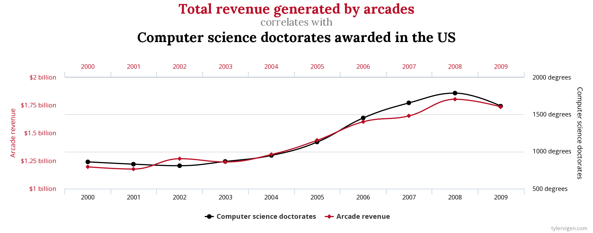
Always remember, correlation isn’t causation. For example, if you hear that increased consumption of ice cream is correlated with increased incidences of drowning, don’t go on a diet just yet. Ice cream doesn’t cause drowning: people just happen to swim more often and also eat ice cream more often in the summer.
You can even visit the site “spurious correlation” to see what crazy things you can “prove” if you’re just given enough data.
This is why we need to do A/B tests, rather than just analysing existing differences in users: it is almost the only way to prove that a difference in user behaviour is due to the feature we changed.
Is the sample size too small?
In general, the more users you add to your A/B test, the greater the confidence you have that your experiment results are not down to random chance. A T test and other frameworks can let you know when you can finish a controlled, randomised experiment within your predefined confidence rating.
Beware, the likelihood of a fluke result increases the more experiments you run. This XKCD cartoon sums it up perfectly:
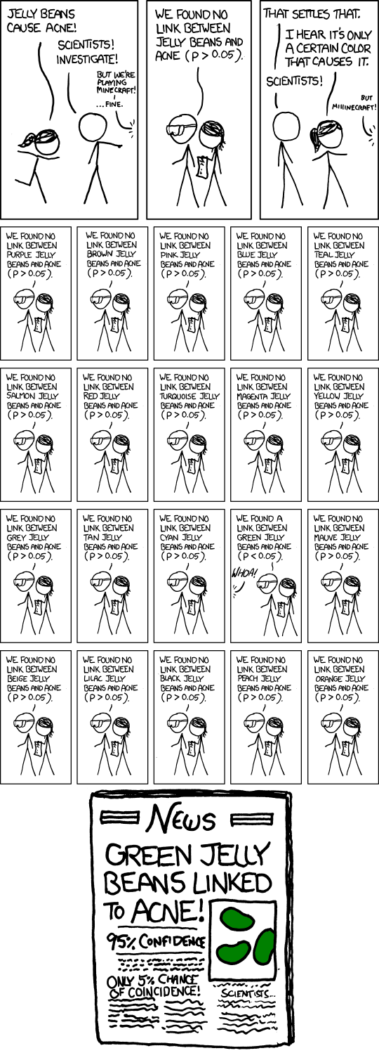
– XKCD - https://xkcd.com/license.html
Want to read more?
If you want to learn more about understanding common errors in collecting and analysing data, a friendly and entertaining read is Ben Goldacre’s “Bad Pharma”.
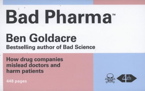
I picked this book up thinking it was about the world of medicine, and found that almost every issue he discussed about medical research applied to the world of data driven development.
Enjoyed that? Read some other posts.
Related Posts
23 Nov 2022—Connor Charles, Andrew Crosby, Jason Motee, Michael Reppion, Olivia Pennington
Photo by Markus Quinten de Graaf on Unsplash
Here at Auto Trader, we aim to help customers find their perfect vehicle as quickly and easily as possible. But with over 400k vehicles advertised onsite at any one...
