Navigating Turbulence with our Landing Page Performance Model

Photo by Pascal Meier on Unsplash.
At Auto Trader, we define landing pages as the first page a consumer sees when they enter our website. As you’d probably expect, the Auto Trader homepage is one of our most common landing pages, as that is usually where a consumer would start when beginning their vehicle-buying journey. In this blog post, I’ll be talking about how we’ve developed our understanding of landing pages through the production of our new Landing Page Performance model, and why it is the next step towards self-serve data at Auto Trader.
What does landing page data look like?
Landing page performance data at Auto Trader is typically split by the route a consumer takes to get to the website - often referred to as traffic source grouping or channel grouping - and can include channels such as organic search (finding us organically through a search engine) or email (by clicking email links). It is helpful to know where consumers are landing from as it informs marketing on the success of their campaigns which, in turn, influences the resources put into them.
Whilst many tables with landing page performance data were available in our BI tool Looker, they all used our page_context_name field as the page identifier, something which usually requires technical knowledge of our Snowplow client-side tracking to extract. The page_context_name field can also encompass multiple pages so may not always show data for a single page on our site. We wanted to create a model which bypassed these blockers and instead used page_url, a unique identifier which anyone in the business could easily find for themselves in their browser and use to get the data for the page they’re looking at. As a consequence, it would reduce the need for analysts to extract this data on an ad-hoc basis, and instead create a self-serve model for other business areas to use. We previously had this functionality available in Google Analytics (GA) but due to Auto Trader’s migration towards using Snowplow data, the model was no longer available, so we also wanted to replace what we had lost from GA.
And so, the landing page performance model was born! But how does it work?
Our aim was to build a model that allowed the user to filter by page_url and view key performance metrics split by traffic source grouping, as shown in the visualisation below.
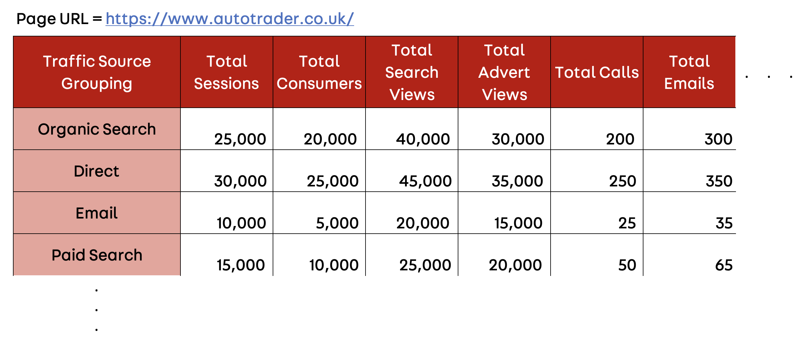
An example of the Landing Page Performance model structure. The data used is for illustrative purposes and not representative of our real data.
To achieve this, the landing page performance model uses three key client-side tables, developed by the User Analytics team here at Auto Trader:
• consumer_views, looking at consumer behaviour on a page view level
• consumer_sessions, looking at consumer behaviour on a session level
• consumer_sessions_with_attribution, an extension of consumer_sessions with three different attribution models (at Auto Trader, we commonly use the last click non-direct attribution model)
As shown in the diagram below, we combined the fields from all three of these tables into one join: consumer_sessions_with_attribution gave us traffic source grouping; consumer_views added page URL; and consumer_sessions rounded everything off with the metrics we tend to care about most in relation to a landing page, such as sessions, consumers, search views, advert views and lead interactions.
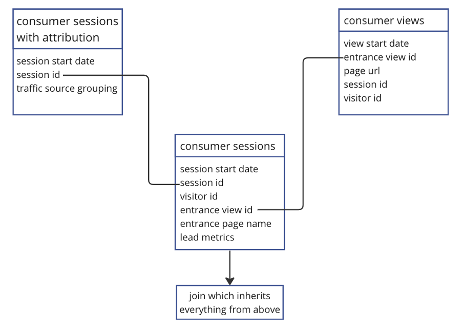
A simplified mapping of how our tables join to create the landing page performance model.
By joining all of these fields into one table, we had everything we needed to build upon our initial vision, and hence productionise in Looker for other business areas to use.
How was the process of building this model?
One main driver of productionising this idea in dbt was the huge query size (and cost) that came with joining three large tables in BigQuery, especially in the instances where users of this data need a wider date range. The origin of this model was a single query, with a query size of approximately 30GB for only 2 days worth of data. Contrastingly, by implementing this model in dbt, we were able to shrink the 2-day query size down to around 2.5GB, so the cost-saving benefits alone made it worthwhile to continue with this project.
The nature of dbt modelling also meant the original query could be split out into different subqueries, which personally aided in my understanding of what the model was trying to do. For example, we brought in our Input Data Ports (shown in the diagram above) as the base layer, defined the fields we wanted from each table in the staging layer and applied the majority of the logic in the Output Data Port (ODP) layer. This allowed for easier readability and meant that we could verify the numbers at each stage of the model – if something didn’t look correct, we’d know where the issue occurred. In a broader sense, by breaking down the code into smaller subqueries we ensured that the logic of the code is more accessible to any teams that will be using the ODP.
In spite of this, the complexity of the model itself meant we spent a lot of time debugging our data, as the numbers shown did not match up to what we were expecting. We used the output from consumer_sessions as a comparison, focusing on the total sessions and consumers associated with each traffic source grouping. Realistically these numbers should’ve been very close to our model’s output, but we were seeing large discrepancies.
During the conceptualisation process, the plan was to make this model highly aggregated in dbt, meaning we would sum the counts of every metric and only provide a total value. After investigating the problem by breaking down the query, we realised the level of aggregation was skewing the results. We had aggregated too early in the query and, as such, data wasn’t being counted and instead was missed.
Our way around this was to make the model less aggregated in dbt, with each row of the output showing the activity for a single session. Since this model was to be exposed in our BI tool, Looker, it made sense to have the last step of aggregation in the tech stack. There, we could count the totals of each column and create the output we had envisioned at the start of the project.
Summary
Whilst this model took a while to develop and had its pain points, we have now successfully shifted what was previously a manual query requiring analyst input into a self-serve model that can be used by anyone in the business. The end product of a Looker dashboard with filtering to show relevant data has created the opportunity for other areas of the business, particularly those with less technical knowledge of our front-end tracking implementation, to obtain the data they need quickly and autonomously. As such, through greater visibility and knowledge of how our landing pages are performing, business functions such as marketing campaigns can be understood better and changes can be made more efficiently.
Enjoyed that? Read some other posts.
Related Posts
05 Apr 2024—Bethanie Garfin
Photo by Kenrick Baksh on Unsplash
At Auto Trader, the behavioural events we collect about our consumers are a core part of our data platform, fueling real-time personalisation on-site and reporting our core business KPIs. Because...
09 Jan 2024—Steven Morrow
Photo by Davide Ragusa on Unsplash.
In the late nineties and early noughties, every developer was adding a hit counter to their website. It essentially counted the number of page views...
